
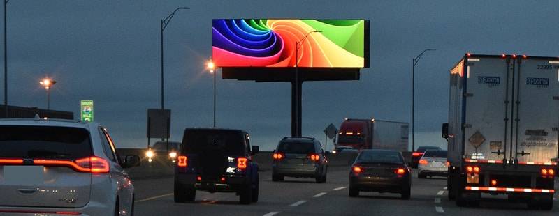
There’s no denying that the billboard is one of the most effective advertising mediums there is. With millions of eyes passing by every single day, it’s easy to see why businesses are flocking to this form of advertising. It’s also an effective way for brands to communicate with consumers who may not be actively searching for their product or service online. Whether you need help creating your first billboard or just want to learn more about what makes a good one tick, this article will give you everything you need to know about these large ad spaces.
-
What Works
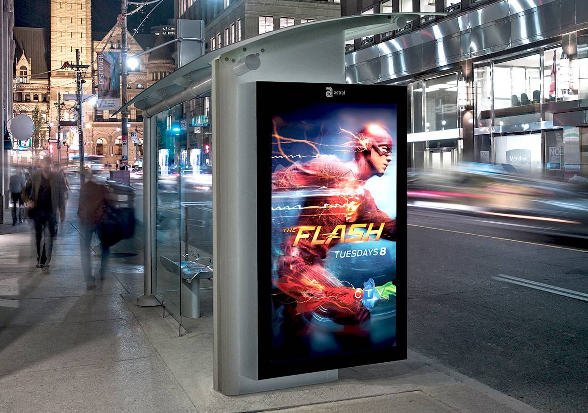
- Contrasting colors. The best-performing ads tend to have bold and contrasting colors that stand out against the background. The contrast can be in the logo, text or background color—whatever you choose, make sure it’s different from everything else on the billboard.
- Bold and clear fonts. You want your message to be easy for passersby to read from a distance, which means using simple sans-serif fonts like Helvetica or Arial will work best for your billboard ad copy. Don’t use overly decorative fonts either; if you want people to read what you have written on your billboard, don’t make them squint or strain their eyes trying!
- Short and memorable messaging: Advertisers who write longer messages are less successful than those who keep things short and sweet (e.g., “Buy Now! Today Only!”). Shorter messages allow more room above and below so they can run alongside other shorter ads too – another reason why shorter copy is better than longer content in general!
-
What Doesn’t Work
- Yes or No Questions
If you have a question for your audience, ask it directly. Don’t make them work to find the answer in the content of your ad. It’s much more effective to simply ask them if they like chocolate ice cream over vanilla (or vice versa). Then, provide them with a simple answer: “Yes!” or “No!” The first option will encourage people to actually click on your ad and read its entire message. The second option will likely lead people away from your message (and potentially cause them to write negative reviews about how confusing your ad was).
- Redundancy
Avoid redundancy at all costs—it bores readers and turns them off of reading any further than necessary. There are many ways that advertisers can incorporate redundancy into their advertisements—for instance, by repeating the same information again in different places within an advertisement (e.g., “50% off all drinks today!”) or by using too many visuals on one page (e.g., multiple images clustered together so closely that they become indistinguishable). When you’re writing text ads for Facebook Ads Manager, avoid these pitfalls by keeping things simple: keep each line focused on one idea only and avoid overcrowding the page with too many different elements at once!
-
If you’re looking for some inspiration, take a look at a few of the world’s best billboard ads for ideas.
Billboards are a great way to get your message out there, but if you’re looking for some inspiration, take a look at the world’s best billboard ads for ideas.
Billboards are used to promote everything from movies and food to political causes. They can be used in both outdoor and indoor spaces, and they often use large images or words that people will see from far away. Some of the most famous billboards have been around since the 1940s or 50s!
Conclusion
We hope the examples above have inspired you to create a billboard ad that gets noticed, shared, and talked about.